LSNA Information Architecture
Volunteer project to help a community-based organization update and organize their website
Logan Square Neighborhood Association’s call for help - answered!
One evening I was searching online for volunteer opportunities in Chicago, and I happened upon a post for the Logan Square Neighborhood Association. They were updating their website, and needed help organizing it. It was the perfect opportunity for me - made even better by being able to help a great organization.
First Steps
I got an email from one of their employees, Jessica, saying they were interested in having me help so we arranged to have a phone conversation to get the ball rolling!
Prior to our phone call I took a look through their website and wrote down some basic questions to get a better understanding of my role and how I could help.
1. Who is this website for?
2. What are your goals for the new website?
3. What’s working well on your current website?
4. What isn’t working well on your current website?
After our initial phone conversation I had a better understanding of LSNA’s needs, but still had a lot to learn. I took a deep dive into their existing website - and there was A LOT to dive through - this would become the main problem area and focal point of my work with them.
Pictured above: LSNA’s home page showing the primary navigation.
Time to Meet up, Discuss, and Get Questions Answered!
Image taken from LSNA current home page, with permission.
Before I asked all my questions about the organization of the website and the individual programs, I needed to understand who their users are.
Who is using this website?
Doner - Individual people giving donations.
Sponser - Companies and local businesses giving donations.
People approving Grants that LSNA apply for, which includes both Private and Government funded grants.
People in the community using the services LSNA offers and also people who want to volunteer - the latter being a very small percentage
We agreed the most important areas of focus for our work together would be to simplify the navigation, create a prominent call to action donate button, and see what we could cut out of the website. Once I understood who is using their website we tackled the Site map/navigation to determine what could possibly be grouped or cut out.
Navigating through an Information Heavy Website
The first thing I noticed about their website was all the layers of information and how the organization of it did not always make sense. For example: “Quality of Life Planning/Holistic Plan” is part of the primary navigation, but “Holistic Plan” is in the secondary navigation on the “About Us” page.
Pictured above : LSNA’s primary navigation bar, with the “About Us” link selected. Below the primary navigation is a secondary navigation on the right side of the page.
After going through the website together and learning about the programs, we already determined the “Youth Team’s #BrownIn Chicago Project” did not need to be in the main navigation, but could be moved to the news archives for staff.
I learned more about the Parent Engagement Institute and how it is a part of the Parent Mentor Program. A program that they are developing to implement in other towns. I suggested it be a complete website of its own since the program has taken off and is being developed on a much larger scale outside of LSNA.
“Identifying that the Parent Engagement Institute could be a website of its own was a great idea that we hadn’t thought of.”
We concluded our first meeting knowing our next step was a card sort. I wanted to understand how their users expected everything to be organized.
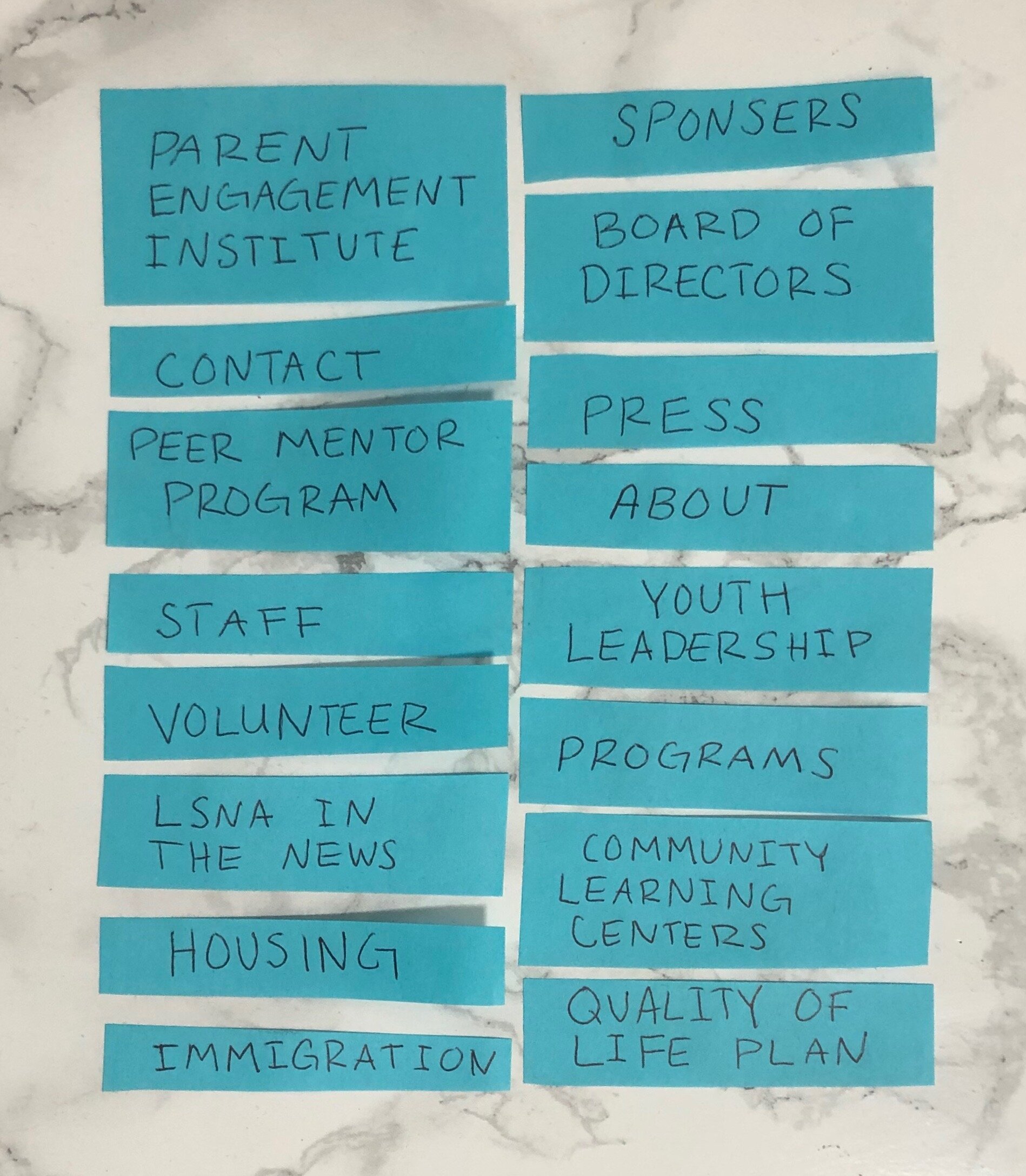
Card Sort
To create the cards for the card sort I listed all of the options on the LSNA’s current website, leaving out one option that was no longer relevant to the organization. I also added some key terms that Jessica said had to be present on the new website.
We administered the card sort online . We surveyed a variety of the users including: LSNA’s office manager, a board member, a parent mentor, and a member of the community who uses LSNA’s services.
Card Sort Results
Participants were asked to group the listed cards, and give a title to each group. If one card had the same verbiage that they would use as the title they were told to include it in the group and still title the group with the duplicate verbiage.
Luckily there were a lot of similarities in how participants decided to group and title the cards.
Jessica and I reviewed the card results together, and were able to condense the primary navigation to only four options. Each primary navigation option has a drop down of secondary navigation options.
Pictured above: LSNA’s new website header.
Pictured Above: LSNA’s old website header.
Results
The new navigation cut out a lot of unnecessary links and information.
The Donation button is moved to the Header of the website so its always easily available to the user. This is their most important call to action and was on Jessica’s lists of Must’s for the redesign. With a shorter list of main navigation options in the header there is room to make the donation button even larger.
LSNA in the news is mainly only used by the staff to reference past articles, so we moved it to the Home Page. Staff can click on “LSNA in the News” which will lead them to a different page to search through the archives.
Below are Site Maps of both the old website, and the new website. Through understanding LSNA’s programs, users, and goals we were able to organize and simplify their website while still providing all the important information and call to actions.


